This situation creates significant barriers:
- Long queues and order delays during peak hours
- Payment confusion between cash and UPI transactions
- Increased stress for staff and poor ordering experience for students
Speed Is a Baseline, Not a Feature
The “Mobile-First” Expectation Is Unmet
The Order & Payment Experience Is the Core Failure
High Crowd Pressure Increases Errors
Operational & Cost Concerns
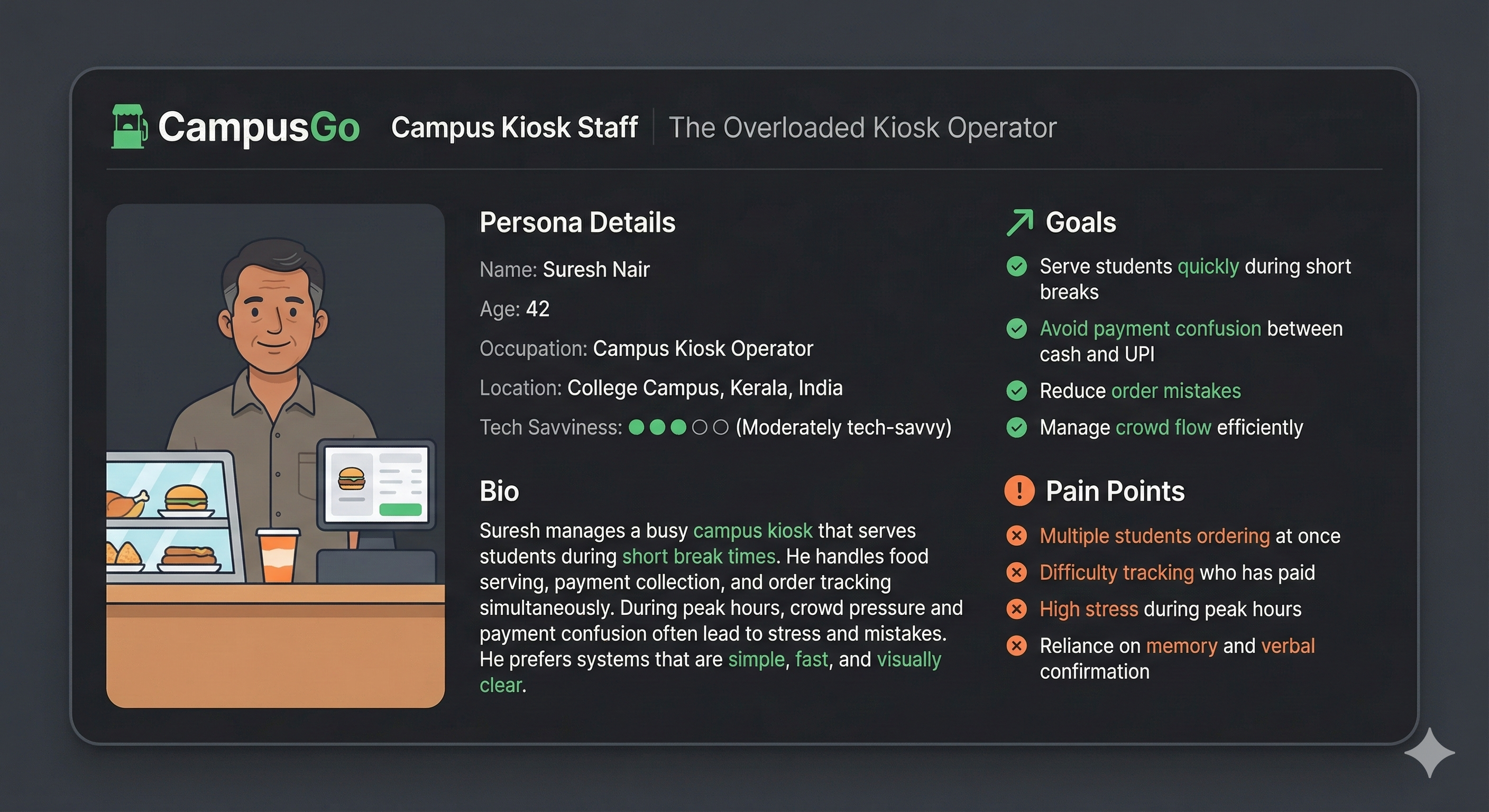
Suresh Nair – The Overloaded Kiosk Operator
Typography Hierarchy
Color Palette
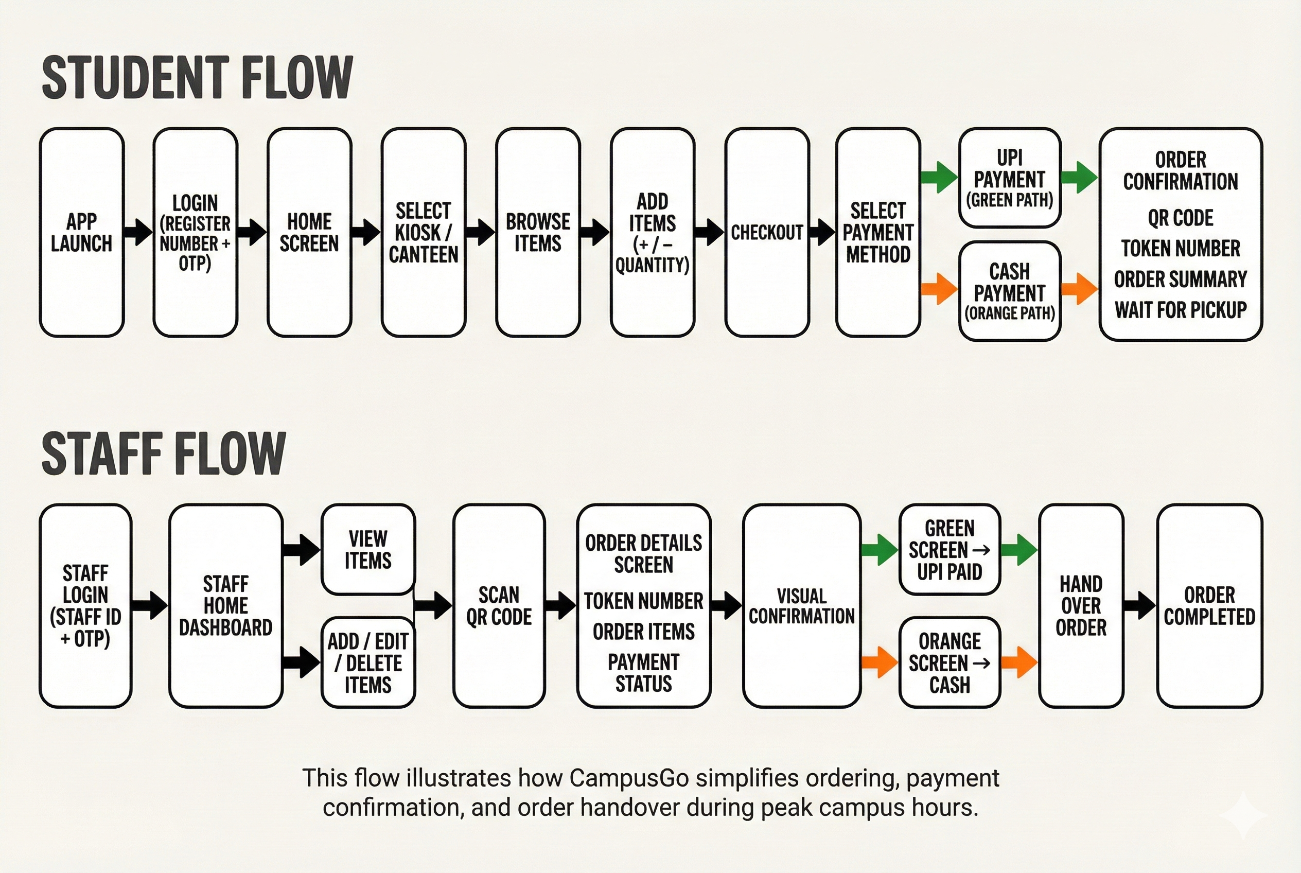
Task Flow
Typography Usage Guidelines
Payment Confusion Creates Losses
Dependency on Memory Increases Errors
Order Tracking Frustration
Payment Verification Issues
Need for Clear Visual Confirmation
Key Pain Points Discovered
Survey Findings
Affinity Mapping Results
Research Insights
User Research & Insights
User Persona
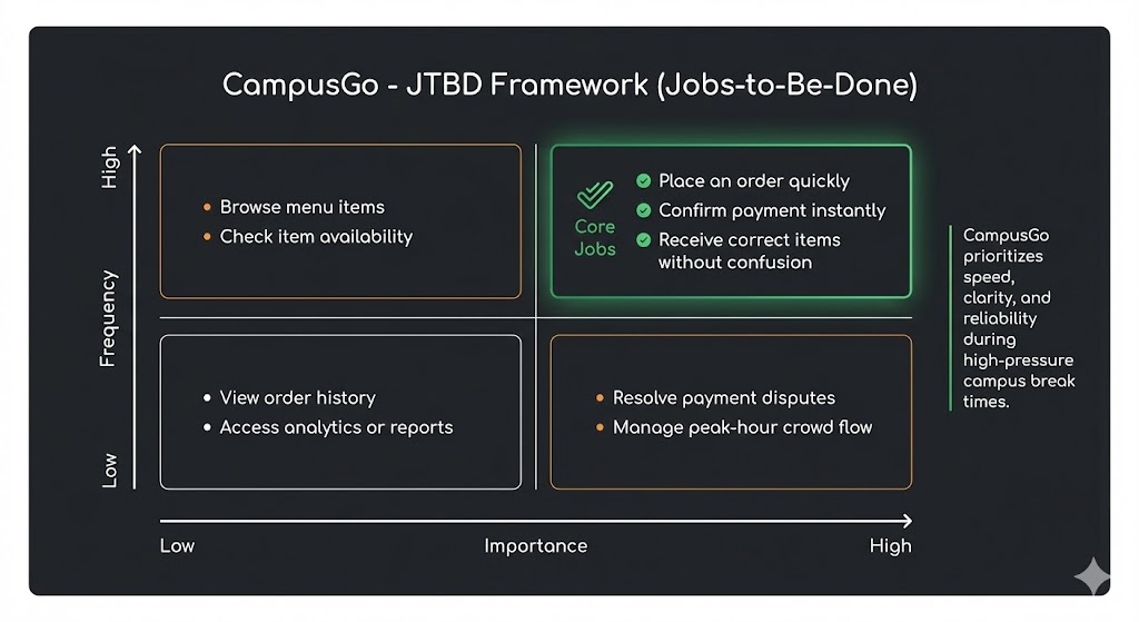
Core Jobs Identified
Design System
Key Design Decisions
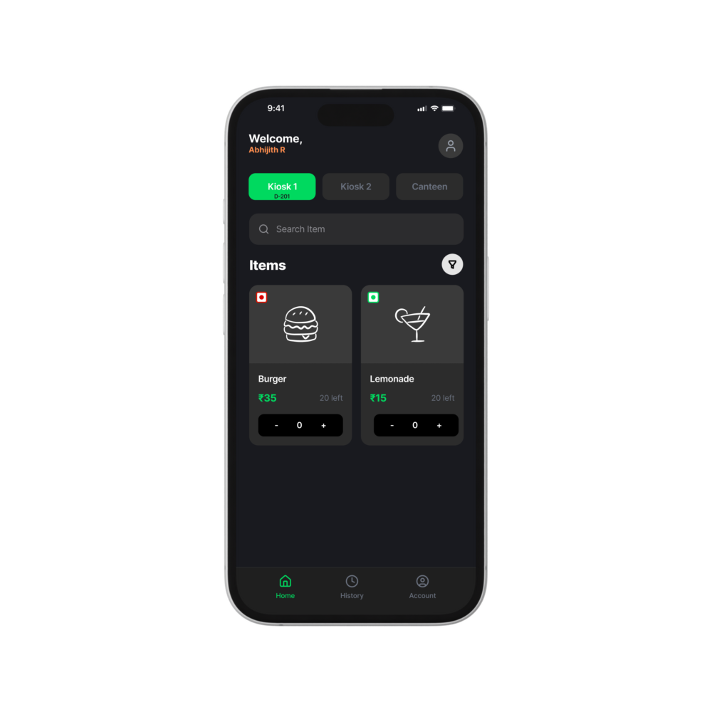
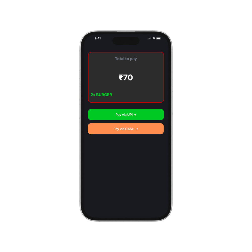
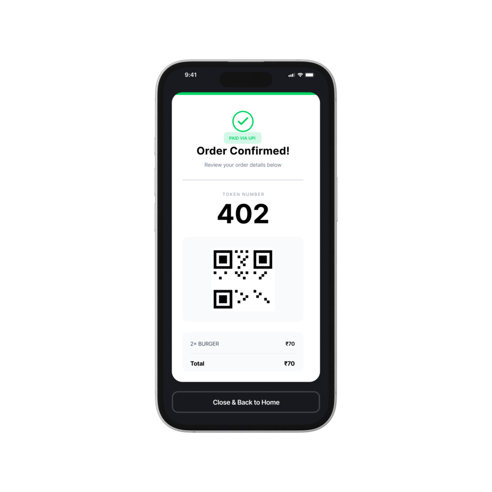
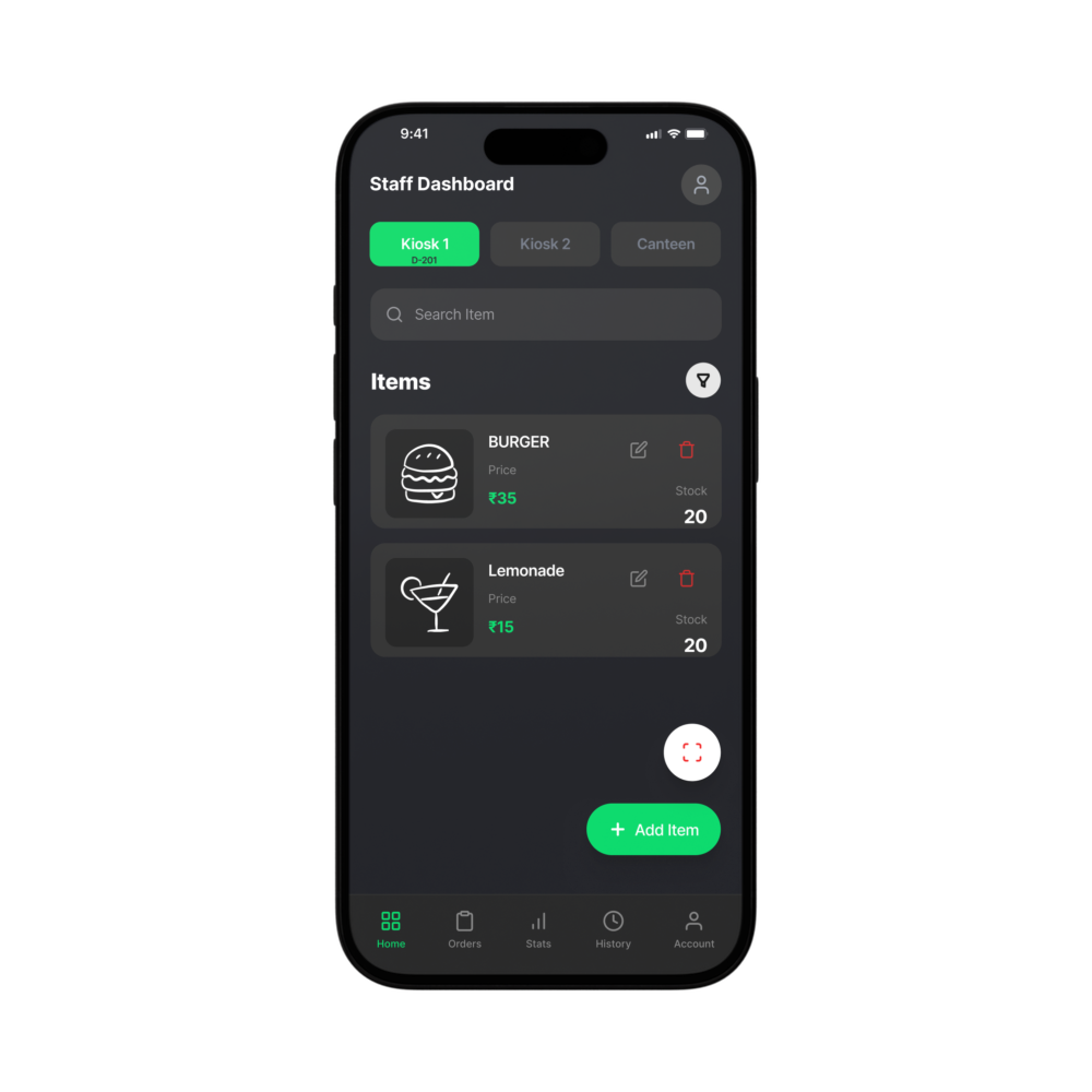
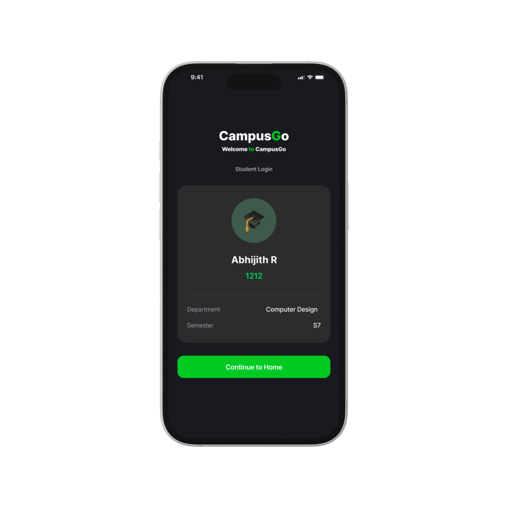
Key Features Demonstrated
campusgo
Design Case Study: A comprehensive design solution addressing the everyday challenges faced by students and campus staff in managing kiosk orders, payments, and crowd flow during peak hours.

Problem Statement
Students and campus kiosk staff struggle to manage food ordering during short break times. Manual ordering, cash handling, and payment confirmation create confusion, delays, and missed payments—especially when crowd volume is high.
During short campus breaks, students expect fast ordering and instant confirmation. Any delay—whether in taking orders or confirming payment—quickly leads to frustration and crowding.
Students are comfortable with mobile apps, but kiosk operations are still largely manual. Staff often rely on memory, verbal orders, or loosely tracked UPI payments, which feels outdated and error-prone.
Time Is the Biggest Constraint
Campus kiosks operate during very short breaks. Any system that slows ordering or payment directly affects both staff efficiency and student experience.
Staff often struggle to track who has paid via UPI versus cash, leading to missed payments or repeated confirmations.
In the absence of a structured system, staff rely on memory or verbal confirmation, which becomes unreliable during heavy crowd flow.
Demographics:
- Age: 42
- Occupation: Campus Kiosk Staff
- Location: College campus, Kerala, India
- Tech Savviness: ● ● ● ○ ○ (Moderately Tech-Savvy)
Pain Points
- Order Confusion: Multiple students ordering at once leads to mistakes
- Payment Tracking Stress: Hard to verify cash vs UPI payments during rush
- High Pressure Environment: Short breaks create crowding and constant urgency
Reliability: Ensure orders and payments are tracked accurately during peak hours without confusion.
Speed: Enable fast ordering and handover within short campus break times.
Clarity: Provide clear visual confirmation of orders and payment status for both students and staff.
Headings (Inter Semi Bold / Bold):
Used for screen titles, key alerts, and primary messages that need immediate attention.
Body Text (Inter Regular):
Used for descriptions, helper text, onboarding explanations, and informational content for clear readability.
Labels (Inter Medium):
Used for category chips, filters, input labels, and navigation text.
UI Actions (Inter Semi Bold):
Used for buttons, CTAs, success messages, and important interactive elements.
1. App-Based Ordering Over Manual Requests
Rationale: Removes verbal ordering chaos and reduces mistakes during crowded break times.
2. Mobile-First Student Experience
Rationale: Matches how students naturally interact with services—quick, app-based, and accessible from their phones.
3. Visual Payment Confirmation (QR & Color States)
Rationale: Instantly shows whether an order is paid (UPI) or pending (cash), reducing payment disputes.
4. Simplified Staff Workflow
Rationale: Allows kiosk staff to manage orders, items, and payments with minimal training and cognitive load.
- Mobile-first ordering interface with large, touch-friendly actions for quick use during short breaks
- Clear payment visibility using color-coded states for UPI and cash transactions
- Low-effort ordering flow that minimizes interaction for both students and staff
- QR-based order confirmation for fast, error-free handover at the kiosk
- Simple staff dashboard to manage items, orders, and daily activity at a glance
Staff want a system that:
- Requires minimal learning
- Works reliably during peak hours
- Doesn’t demand constant checking or manual tracking
- Large volumes of students order simultaneously
- Staff struggle to keep up with requests and payments
- Mistakes lead to unpaid orders, delays, and stress
Food is ready and available, but managing orders is the real challenge:
- Difficulty tracking who has paid
- Confusion between cash and UPI transactions
- Orders missed or served to the wrong student
This turns a simple kiosk into a chaotic experience during peak hours.
“During rush hours, I can’t remember who ordered what.”
“Students say they’ve paid, but I can’t always confirm immediately.”
“If I could just scan and see the order instantly, it would be much easier.”
“Too many students speak at once, and orders get mixed up.”
“Cash and UPI together make it confusing.”
“Something visual would reduce mistakes.”
Typography Direction
Typography Direction
Typography Direction
Typography Direction
Typography Direction
Typography Direction
This case study explores how UX design can align student convenience with staff efficiency in a fast-paced campus environment.
Thanks for coming :)

#191A1F

#00C924

#FF8D4E

#352824
This situation creates significant barriers:
- Long queues and order delays during peak hours
- Payment confusion between cash and UPI transactions
- Increased stress for staff and poor ordering experience for students
Speed Is a Baseline, Not a Feature
The “Mobile-First” Expectation Is Unmet
The Order & Payment Experience Is the Core Failure
High Crowd Pressure Increases Errors
Operational & Cost Concerns
Suresh Nair – The Overloaded Kiosk Operator
Typography Hierarchy
Color Palette
Task Flow
Typography Usage Guidelines
Payment Confusion Creates Losses
Dependency on Memory Increases Errors
Order Tracking Frustration
Payment Verification Issues
Need for Clear Visual Confirmation
Key Pain Points Discovered
Survey Findings
Affinity Mapping Results
Research Insights
User Research & Insights
User Persona
Core Jobs Identified
Design System
Key Design Decisions
Key Features Demonstrated
campusgo
Design Case Study: A comprehensive design solution addressing the everyday challenges faced by students and campus staff in managing kiosk orders, payments, and crowd flow during peak hours.
Problem Statement
Students and campus kiosk staff struggle to manage food ordering during short break times. Manual ordering, cash handling, and payment confirmation create confusion, delays, and missed payments—especially when crowd volume is high.
During short campus breaks, students expect fast ordering and instant confirmation. Any delay—whether in taking orders or confirming payment—quickly leads to frustration and crowding.
Students are comfortable with mobile apps, but kiosk operations are still largely manual. Staff often rely on memory, verbal orders, or loosely tracked UPI payments, which feels outdated and error-prone.
Time Is the Biggest Constraint
Campus kiosks operate during very short breaks. Any system that slows ordering or payment directly affects both staff efficiency and student experience.
Staff often struggle to track who has paid via UPI versus cash, leading to missed payments or repeated confirmations.
In the absence of a structured system, staff rely on memory or verbal confirmation, which becomes unreliable during heavy crowd flow.
Demographics:
- Age: 42
- Occupation: Campus Kiosk Staff
- Location: College campus, Kerala, India
- Tech Savviness: ● ● ● ○ ○ (Moderately Tech-Savvy)
Pain Points
- Order Confusion: Multiple students ordering at once leads to mistakes
- Payment Tracking Stress: Hard to verify cash vs UPI payments during rush
- High Pressure Environment: Short breaks create crowding and constant urgency
Reliability: Ensure orders and payments are tracked accurately during peak hours without confusion.
Speed: Enable fast ordering and handover within short campus break times.
Clarity: Provide clear visual confirmation of orders and payment status for both students and staff.
Headings (Inter Semi Bold / Bold):
Used for screen titles, key alerts, and primary messages that need immediate attention.
Body Text (Inter Regular):
Used for descriptions, helper text, onboarding explanations, and informational content for clear readability.
Labels (Inter Medium):
Used for category chips, filters, input labels, and navigation text.
UI Actions (Inter Semi Bold):
Used for buttons, CTAs, success messages, and important interactive elements.
1. App-Based Ordering Over Manual Requests
Rationale: Removes verbal ordering chaos and reduces mistakes during crowded break times.
2. Mobile-First Student Experience
Rationale: Matches how students naturally interact with services—quick, app-based, and accessible from their phones.
3. Visual Payment Confirmation (QR & Color States)
Rationale: Instantly shows whether an order is paid (UPI) or pending (cash), reducing payment disputes.
4. Simplified Staff Workflow
Rationale: Allows kiosk staff to manage orders, items, and payments with minimal training and cognitive load.
- Mobile-first ordering interface with large, touch-friendly actions for quick use during short breaks
- Clear payment visibility using color-coded states for UPI and cash transactions
- Low-effort ordering flow that minimizes interaction for both students and staff
- QR-based order confirmation for fast, error-free handover at the kiosk
- Simple staff dashboard to manage items, orders, and daily activity at a glance
Staff want a system that:
- Requires minimal learning
- Works reliably during peak hours
- Doesn’t demand constant checking or manual tracking
- Large volumes of students order simultaneously
- Staff struggle to keep up with requests and payments
- Mistakes lead to unpaid orders, delays, and stress
Food is ready and available, but managing orders is the real challenge:
- Difficulty tracking who has paid
- Confusion between cash and UPI transactions
- Orders missed or served to the wrong student
This turns a simple kiosk into a chaotic experience during peak hours.
“During rush hours, I can’t remember who ordered what.”
“Students say they’ve paid, but I can’t always confirm immediately.”
“If I could just scan and see the order instantly, it would be much easier.”
“Too many students speak at once, and orders get mixed up.”
“Cash and UPI together make it confusing.”
“Something visual would reduce mistakes.”
Typography Direction
Typography Direction
Typography Direction
Typography Direction
Typography Direction
Typography Direction
This case study explores how UX design can align student convenience with staff efficiency in a fast-paced campus environment.
Thanks for coming :)
#191A1F
#00C924
#FF8D4E
#352824
This situation creates significant barriers:
- Long queues and order delays during peak hours
- Payment confusion between cash and UPI transactions
- Increased stress for staff and poor ordering experience for students
Speed Is a Baseline, Not a Feature
The “Mobile-First” Expectation Is Unmet
The Order & Payment Experience Is the Core Failure
High Crowd Pressure Increases Errors
Operational & Cost Concerns
Suresh Nair – The Overloaded Kiosk Operator
Typography Hierarchy
Color Palette
Task Flow
Typography Usage Guidelines
Payment Confusion Creates Losses
Dependency on Memory Increases Errors
Order Tracking Frustration
Payment Verification Issues
Need for Clear Visual Confirmation
Key Pain Points Discovered
Survey Findings
Affinity Mapping Results
Research Insights
User Research & Insights
User Persona
Core Jobs Identified
Design System
Key Design Decisions
Key Features Demonstrated
campusgo
Design Case Study: A comprehensive design solution addressing the everyday challenges faced by students and campus staff in managing kiosk orders, payments, and crowd flow during peak hours.

Problem Statement
Students and campus kiosk staff struggle to manage food ordering during short break times. Manual ordering, cash handling, and payment confirmation create confusion, delays, and missed payments—especially when crowd volume is high.
During short campus breaks, students expect fast ordering and instant confirmation. Any delay—whether in taking orders or confirming payment—quickly leads to frustration and crowding.
Students are comfortable with mobile apps, but kiosk operations are still largely manual. Staff often rely on memory, verbal orders, or loosely tracked UPI payments, which feels outdated and error-prone.
Time Is the Biggest Constraint
Campus kiosks operate during very short breaks. Any system that slows ordering or payment directly affects both staff efficiency and student experience.
Staff often struggle to track who has paid via UPI versus cash, leading to missed payments or repeated confirmations.
In the absence of a structured system, staff rely on memory or verbal confirmation, which becomes unreliable during heavy crowd flow.
Demographics:
- Age: 42
- Occupation: Campus Kiosk Staff
- Location: College campus, Kerala, India
- Tech Savviness: ● ● ● ○ ○ (Moderately Tech-Savvy)
Pain Points
- Order Confusion: Multiple students ordering at once leads to mistakes
- Payment Tracking Stress: Hard to verify cash vs UPI payments during rush
- High Pressure Environment: Short breaks create crowding and constant urgency
Reliability: Ensure orders and payments are tracked accurately during peak hours without confusion.
Speed: Enable fast ordering and handover within short campus break times.
Clarity: Provide clear visual confirmation of orders and payment status for both students and staff.
Headings (Inter Semi Bold / Bold):
Used for screen titles, key alerts, and primary messages that need immediate attention.
Body Text (Inter Regular):
Used for descriptions, helper text, onboarding explanations, and informational content for clear readability.
Labels (Inter Medium):
Used for category chips, filters, input labels, and navigation text.
UI Actions (Inter Semi Bold):
Used for buttons, CTAs, success messages, and important interactive elements.
1. App-Based Ordering Over Manual Requests
Rationale: Removes verbal ordering chaos and reduces mistakes during crowded break times.
2. Mobile-First Student Experience
Rationale: Matches how students naturally interact with services—quick, app-based, and accessible from their phones.
3. Visual Payment Confirmation (QR & Color States)
Rationale: Instantly shows whether an order is paid (UPI) or pending (cash), reducing payment disputes.
4. Simplified Staff Workflow
Rationale: Allows kiosk staff to manage orders, items, and payments with minimal training and cognitive load.
- Mobile-first ordering interface with large, touch-friendly actions for quick use during short breaks
- Clear payment visibility using color-coded states for UPI and cash transactions
- Low-effort ordering flow that minimizes interaction for both students and staff
- QR-based order confirmation for fast, error-free handover at the kiosk
- Simple staff dashboard to manage items, orders, and daily activity at a glance
Staff want a system that:
- Requires minimal learning
- Works reliably during peak hours
- Doesn’t demand constant checking or manual tracking
- Large volumes of students order simultaneously
- Staff struggle to keep up with requests and payments
- Mistakes lead to unpaid orders, delays, and stress
Food is ready and available, but managing orders is the real challenge:
- Difficulty tracking who has paid
- Confusion between cash and UPI transactions
- Orders missed or served to the wrong student
This turns a simple kiosk into a chaotic experience during peak hours.
“During rush hours, I can’t remember who ordered what.”
“Students say they’ve paid, but I can’t always confirm immediately.”
“If I could just scan and see the order instantly, it would be much easier.”
“Too many students speak at once, and orders get mixed up.”
“Cash and UPI together make it confusing.”
“Something visual would reduce mistakes.”
Typography Direction
Typography Direction
Typography Direction
Typography Direction
Typography Direction
Typography Direction
This case study explores how UX design can align student convenience with staff efficiency in a fast-paced campus environment.
Thanks for coming :)

#191A1F

#00C924

#FF8D4E

#352824