This situation creates several everyday challenges:
- Food and medicines expiring unnoticed
- Increased waste and unnecessary spending
- Lack of awareness about what needs to be used first
Expiry Awareness Is a Baseline, Not a Feature
Friction in Daily Use Leads to Drop-Off
The Experience Fails After Entry
Users Are Skeptical of “Smart” Solutions
Financial Awareness & Waste Sensitivity
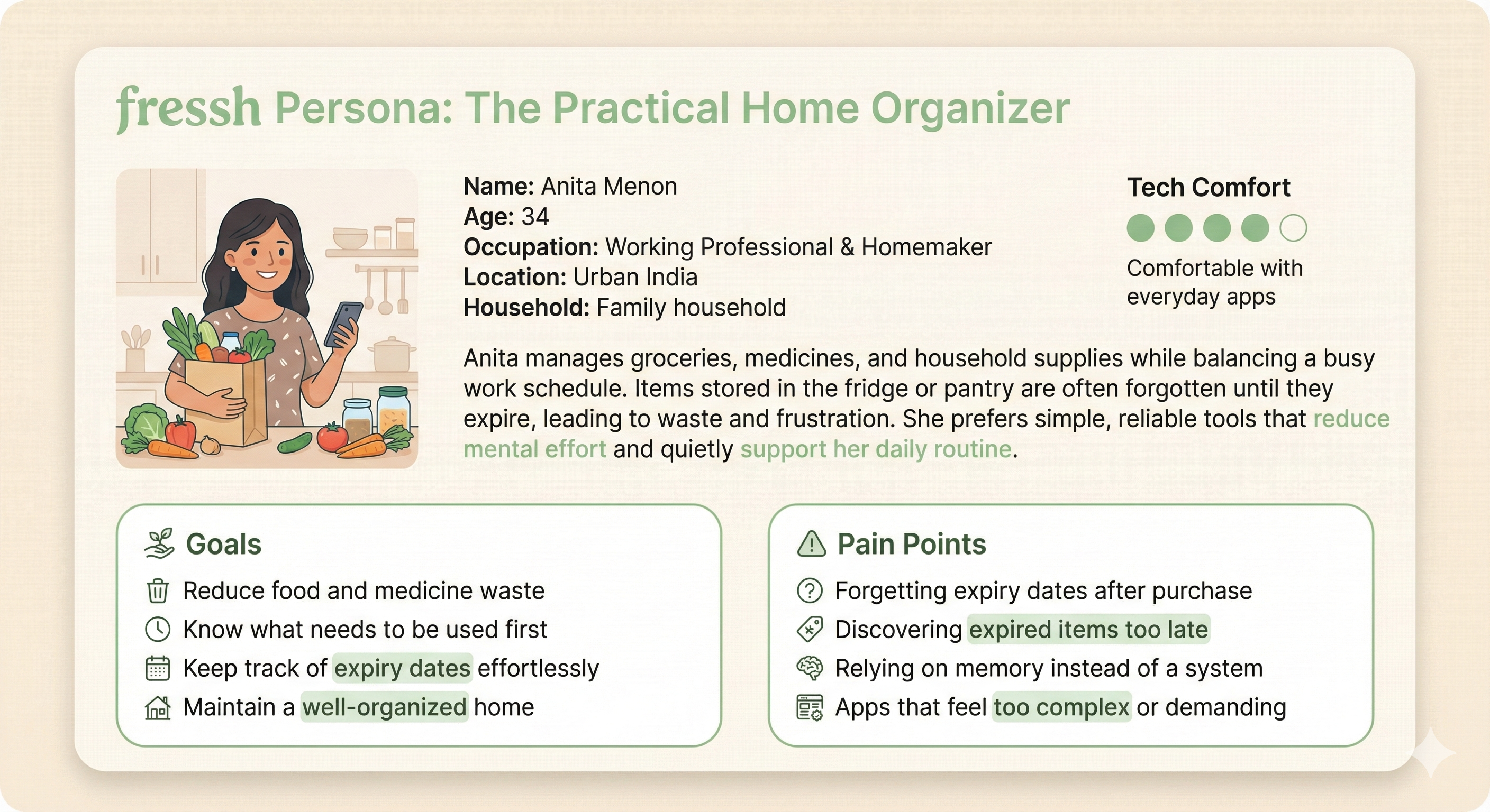
Anita Menon – The Practical Home Organizer
Typography Hierarchy
Color Palette
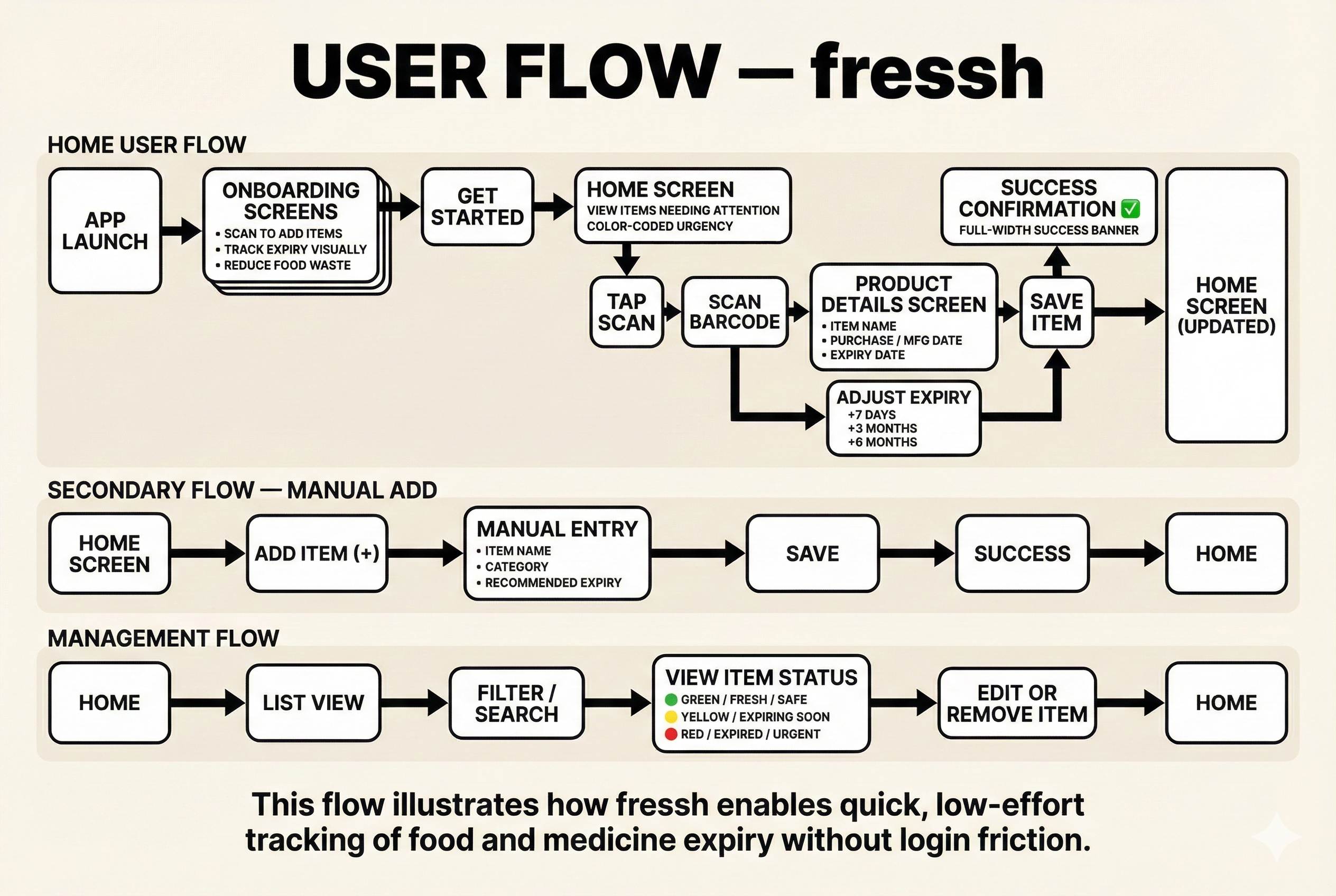
Task Flow
Typography Usage Guidelines
Fear of Forgetting, Not Complexity
“Set It and Forget It” Expectations
Dependence on Memory & Visual Cues
The Waste Frustration
Lack of Priority Visibility
Desire for Simple Guidance
Key Pain Points Discovered
Survey Findings
Affinity Mapping Results
Research Insights
User Research & Insights
User Persona
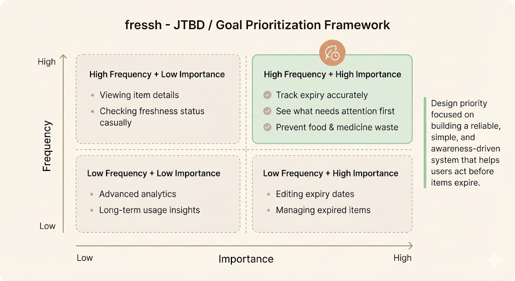
Core Jobs Identified
Design System
Key Design Decisions
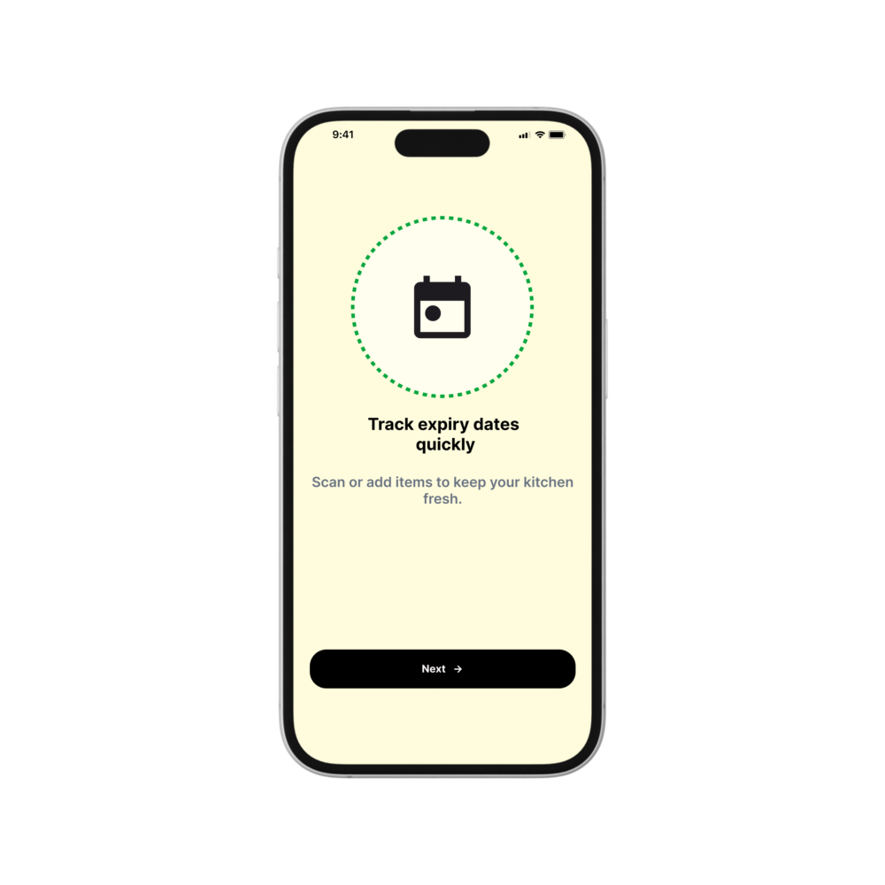
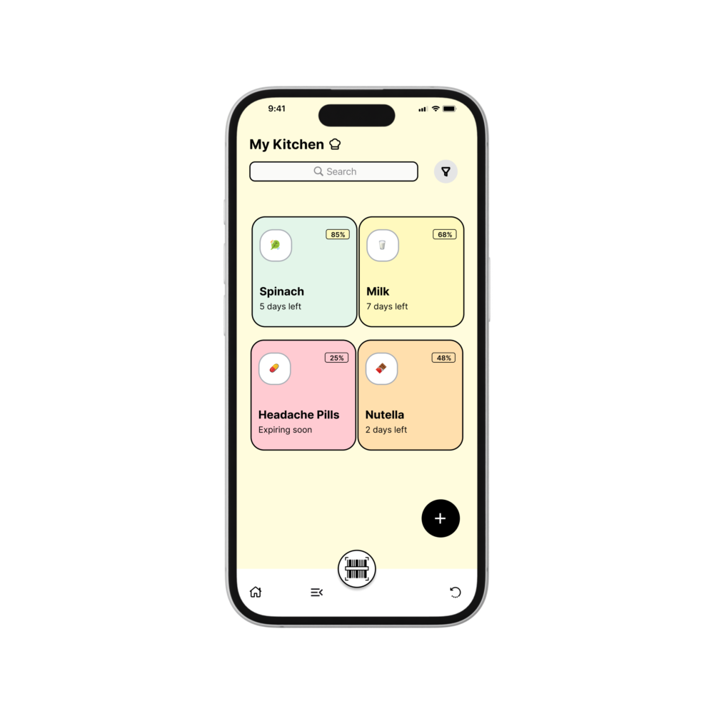
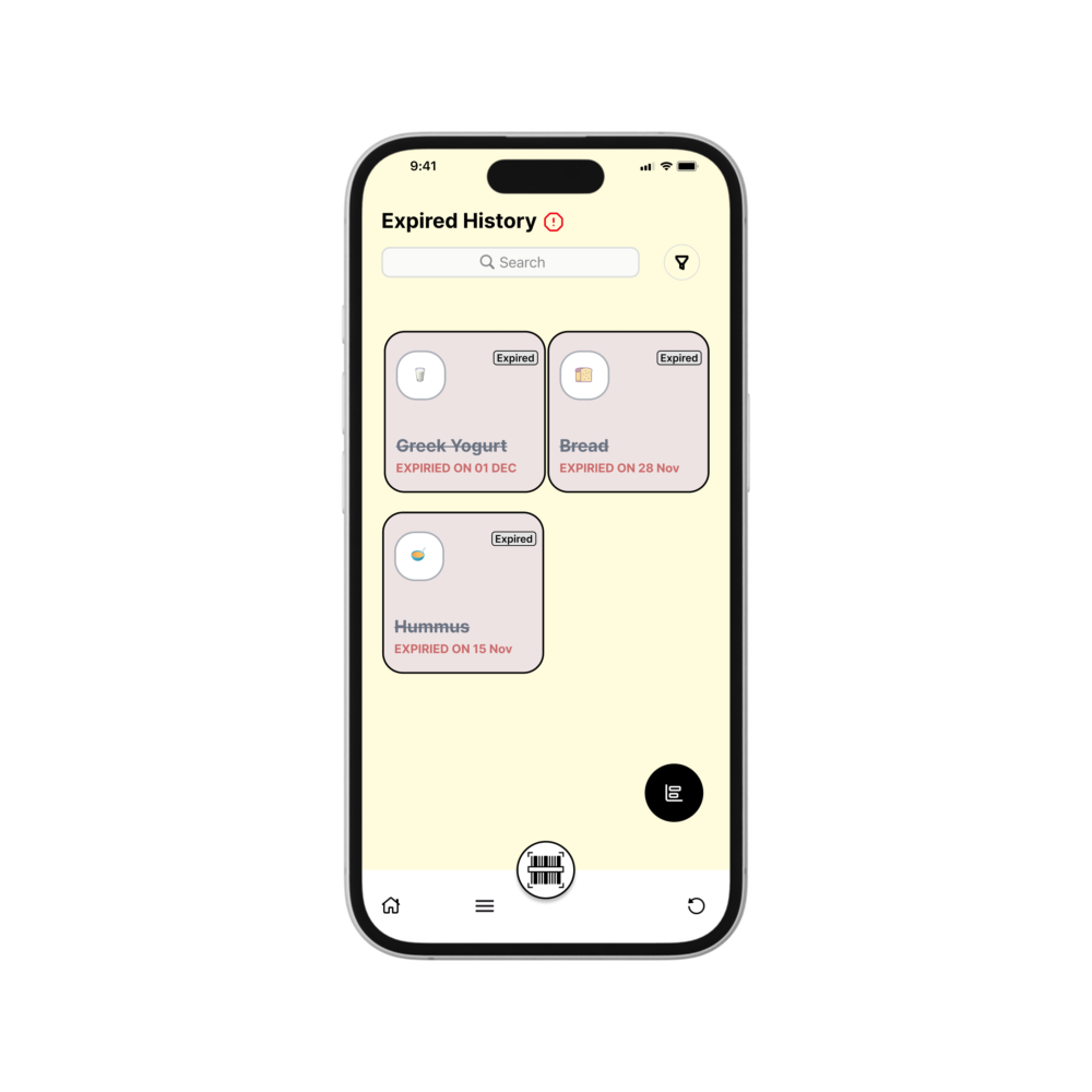
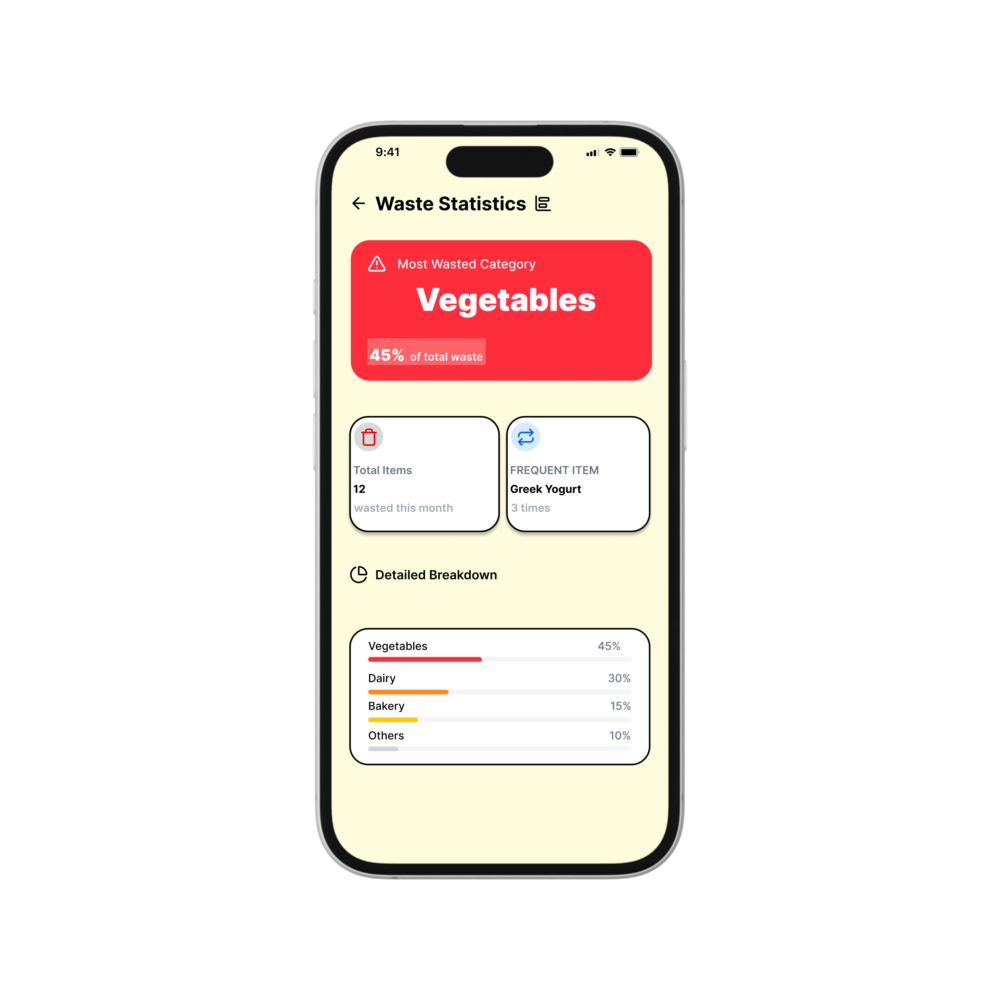
Key Features Demonstrated
Design Case Study: A focused UI/UX solution addressing the everyday challenge of tracking expiry dates for food, groceries, and household items.
Problem Statement
Individuals and households often struggle to keep track of food, groceries, and medicines stored at home. Items are frequently forgotten in cupboards and refrigerators, leading to expired products and unnecessary waste
Users expect basic reminders for expiry dates, especially for food medicines and groceries. However, most existing solutions fail to make expiry awareness clear, visual, and actionable in daily life.
People want quick, mobile-first solutions. Apps that require too many steps, manual entries, or complex setups are often abandoned after initial use.
Users are conscious of money spent on groceries and medicines. Expired items are often seen as avoidable losses, especially in households that plan purchases carefully.
The primary concern isn’t entering data—it’s forgetting what was already bought. Users want a system that works quietly in the background without constant attention.
Most users rely on memory or visual checks (labels, cupboard scanning). When this fails, items are discovered only after expiry.
Demographics:
- Age: 34
- Occupation: Working professional & homemaker
- Location: Urban residential area, Kerala, India
- Tech Savviness: ● ● ● ● ○ (Comfortable with everyday apps)
Pain Points
- Forgotten Items: Food and medicines often get missed until they expire
- Wasted Money: Regularly throws away items that could have been used
- Mental Load: Keeping track of expiry dates feels tiring and unreliable
Awareness: Ensure users always know what items they have and what is nearing expiry.
Waste Reduction: Help users use items before they expire, reducing unnecessary spending.
Simplicity: Provide a system that works quietly in the background without constant manual effort.
Headings (Inter Semi Bold / Bold):
Used for screen titles, key alerts, and primary messages that need immediate attention.
Body Text (Inter Regular):
Used for descriptions, helper text, onboarding explanations, and informational content for clear readability.
Labels (Inter Medium):
Used for category chips, filters, input labels, and navigation text.
UI Actions (Inter Semi Bold):
Used for buttons, CTAs, success messages, and important interactive elements.
1. Scan-First Interaction
Rationale: Leverages familiar barcode scanning behavior to reduce manual entry and speed up the item-adding process.
2. Color-Based Urgency System
Rationale: Uses intuitive color cues (green, yellow, red) to communicate freshness and urgency at a glance.
3. Minimal, Low-Maintenance Experience
Rationale: Keeps the app simple and distraction-free so users can rely on it without constant interaction or learning effort.
- Mobile-first control interface with large, touch-friendly buttons
- Clear visual freshness indicators using color-coded status (green, yellow, red)
- Manual and scan-based item entry to handle all types of groceries and medicines
- Smart awareness cues that help users act before items expire
Once an item is added, users expect:
- Automatic tracking
- Clear alerts
- Minimal manual effort
Any need for repeated updates or checks reduces long-term usage.
- Many users have tried reminder or tracking apps that felt over-engineered
- Complex features reduce trust and adoption
- Users prefer simple, recommendation-based tools that feel human and reliable
While users may initially add items, the problem lies in ongoing usage:
- Items are forgotten after being added
- There is no clear priority of what to use first
- Lack of visual urgency reduces follow-through
As a result, the app becomes static instead of a daily utility.
“I didn’t even remember buying this—it just expired in the back of the fridge.”
“I don’t know what to use first unless it’s already spoiled.”
“If the app just told me what to use next, that would be enough.”
“I end up throwing food away even when I try to plan.”
“Everything looks the same until it’s too late.”
“I don’t need advanced features—just clarity.”
Typography Direction
Typography Direction
Typography Direction
Typography Direction
Typography Direction
Typography Direction

#FFFCE0

#AAAFB6

#FFCDD3

#FFE0B3

#FFF9C4

#E6F4EA
This UX case study demonstrates how thoughtful design can simplify everyday food tracking into an accessible and reliable solution for modern households.
Thanks for coming :)
FRESSH

This situation creates several everyday challenges:
- Food and medicines expiring unnoticed
- Increased waste and unnecessary spending
- Lack of awareness about what needs to be used first
Expiry Awareness Is a Baseline, Not a Feature
Friction in Daily Use Leads to Drop-Off
The Experience Fails After Entry
Users Are Skeptical of “Smart” Solutions
Financial Awareness & Waste Sensitivity
Anita Menon – The Practical Home Organizer
Typography Hierarchy
Color Palette
Task Flow
Typography Usage Guidelines
Fear of Forgetting, Not Complexity
“Set It and Forget It” Expectations
Dependence on Memory & Visual Cues
The Waste Frustration
Lack of Priority Visibility
Desire for Simple Guidance
Key Pain Points Discovered
Survey Findings
Affinity Mapping Results
Research Insights
User Research & Insights
User Persona
Core Jobs Identified
Design System
Key Design Decisions
Key Features Demonstrated
Design Case Study: A focused UI/UX solution addressing the everyday challenge of tracking expiry dates for food, groceries, and household items.
Problem Statement
Individuals and households often struggle to keep track of food, groceries, and medicines stored at home. Items are frequently forgotten in cupboards and refrigerators, leading to expired products and unnecessary waste
Users expect basic reminders for expiry dates, especially for food medicines and groceries. However, most existing solutions fail to make expiry awareness clear, visual, and actionable in daily life.
People want quick, mobile-first solutions. Apps that require too many steps, manual entries, or complex setups are often abandoned after initial use.
Users are conscious of money spent on groceries and medicines. Expired items are often seen as avoidable losses, especially in households that plan purchases carefully.
The primary concern isn’t entering data—it’s forgetting what was already bought. Users want a system that works quietly in the background without constant attention.
Most users rely on memory or visual checks (labels, cupboard scanning). When this fails, items are discovered only after expiry.
Demographics:
- Age: 34
- Occupation: Working professional & homemaker
- Location: Urban residential area, Kerala, India
- Tech Savviness: ● ● ● ● ○ (Comfortable with everyday apps)
Pain Points
- Forgotten Items: Food and medicines often get missed until they expire
- Wasted Money: Regularly throws away items that could have been used
- Mental Load: Keeping track of expiry dates feels tiring and unreliable
Awareness: Ensure users always know what items they have and what is nearing expiry.
Waste Reduction: Help users use items before they expire, reducing unnecessary spending.
Simplicity: Provide a system that works quietly in the background without constant manual effort.
Headings (Inter Semi Bold / Bold):
Used for screen titles, key alerts, and primary messages that need immediate attention.
Body Text (Inter Regular):
Used for descriptions, helper text, onboarding explanations, and informational content for clear readability.
Labels (Inter Medium):
Used for category chips, filters, input labels, and navigation text.
UI Actions (Inter Semi Bold):
Used for buttons, CTAs, success messages, and important interactive elements.
1. Scan-First Interaction
Rationale: Leverages familiar barcode scanning behavior to reduce manual entry and speed up the item-adding process.
2. Color-Based Urgency System
Rationale: Uses intuitive color cues (green, yellow, red) to communicate freshness and urgency at a glance.
3. Minimal, Low-Maintenance Experience
Rationale: Keeps the app simple and distraction-free so users can rely on it without constant interaction or learning effort.
- Mobile-first control interface with large, touch-friendly buttons
- Clear visual freshness indicators using color-coded status (green, yellow, red)
- Manual and scan-based item entry to handle all types of groceries and medicines
- Smart awareness cues that help users act before items expire
Once an item is added, users expect:
- Automatic tracking
- Clear alerts
- Minimal manual effort
Any need for repeated updates or checks reduces long-term usage.
- Many users have tried reminder or tracking apps that felt over-engineered
- Complex features reduce trust and adoption
- Users prefer simple, recommendation-based tools that feel human and reliable
While users may initially add items, the problem lies in ongoing usage:
- Items are forgotten after being added
- There is no clear priority of what to use first
- Lack of visual urgency reduces follow-through
As a result, the app becomes static instead of a daily utility.
“I didn’t even remember buying this—it just expired in the back of the fridge.”
“I don’t know what to use first unless it’s already spoiled.”
“If the app just told me what to use next, that would be enough.”
“I end up throwing food away even when I try to plan.”
“Everything looks the same until it’s too late.”
“I don’t need advanced features—just clarity.”
Typography Direction
Typography Direction
Typography Direction
Typography Direction
Typography Direction
Typography Direction
#FFFCE0
#AAAFB6
#FFCDD3
#FFE0B3
#FFF9C4
#E6F4EA
This UX case study demonstrates how thoughtful design can simplify everyday food tracking into an accessible and reliable solution for modern households.
Thanks for coming :)
FRESSH
This situation creates several everyday challenges:
- Food and medicines expiring unnoticed
- Increased waste and unnecessary spending
- Lack of awareness about what needs to be used first
Expiry Awareness Is a Baseline, Not a Feature
Friction in Daily Use Leads to Drop-Off
The Experience Fails After Entry
Users Are Skeptical of “Smart” Solutions
Financial Awareness & Waste Sensitivity
Anita Menon – The Practical Home Organizer
Typography Hierarchy
Color Palette
Task Flow
Typography Usage Guidelines
Fear of Forgetting, Not Complexity
“Set It and Forget It” Expectations
Dependence on Memory & Visual Cues
The Waste Frustration
Lack of Priority Visibility
Desire for Simple Guidance
Key Pain Points Discovered
Survey Findings
Affinity Mapping Results
Research Insights
User Research & Insights
User Persona
Core Jobs Identified
Design System
Key Design Decisions
Key Features Demonstrated
Design Case Study: A focused UI/UX solution addressing the everyday challenge of tracking expiry dates for food, groceries, and household items.
Problem Statement
Individuals and households often struggle to keep track of food, groceries, and medicines stored at home. Items are frequently forgotten in cupboards and refrigerators, leading to expired products and unnecessary waste
Users expect basic reminders for expiry dates, especially for food medicines and groceries. However, most existing solutions fail to make expiry awareness clear, visual, and actionable in daily life.
People want quick, mobile-first solutions. Apps that require too many steps, manual entries, or complex setups are often abandoned after initial use.
Users are conscious of money spent on groceries and medicines. Expired items are often seen as avoidable losses, especially in households that plan purchases carefully.
The primary concern isn’t entering data—it’s forgetting what was already bought. Users want a system that works quietly in the background without constant attention.
Most users rely on memory or visual checks (labels, cupboard scanning). When this fails, items are discovered only after expiry.
Demographics:
- Age: 34
- Occupation: Working professional & homemaker
- Location: Urban residential area, Kerala, India
- Tech Savviness: ● ● ● ● ○ (Comfortable with everyday apps)
Pain Points
- Forgotten Items: Food and medicines often get missed until they expire
- Wasted Money: Regularly throws away items that could have been used
- Mental Load: Keeping track of expiry dates feels tiring and unreliable
Awareness: Ensure users always know what items they have and what is nearing expiry.
Waste Reduction: Help users use items before they expire, reducing unnecessary spending.
Simplicity: Provide a system that works quietly in the background without constant manual effort.
Headings (Inter Semi Bold / Bold):
Used for screen titles, key alerts, and primary messages that need immediate attention.
Body Text (Inter Regular):
Used for descriptions, helper text, onboarding explanations, and informational content for clear readability.
Labels (Inter Medium):
Used for category chips, filters, input labels, and navigation text.
UI Actions (Inter Semi Bold):
Used for buttons, CTAs, success messages, and important interactive elements.
1. Scan-First Interaction
Rationale: Leverages familiar barcode scanning behavior to reduce manual entry and speed up the item-adding process.
2. Color-Based Urgency System
Rationale: Uses intuitive color cues (green, yellow, red) to communicate freshness and urgency at a glance.
3. Minimal, Low-Maintenance Experience
Rationale: Keeps the app simple and distraction-free so users can rely on it without constant interaction or learning effort.
- Mobile-first control interface with large, touch-friendly buttons
- Clear visual freshness indicators using color-coded status (green, yellow, red)
- Manual and scan-based item entry to handle all types of groceries and medicines
- Smart awareness cues that help users act before items expire
Once an item is added, users expect:
- Automatic tracking
- Clear alerts
- Minimal manual effort
Any need for repeated updates or checks reduces long-term usage.
- Many users have tried reminder or tracking apps that felt over-engineered
- Complex features reduce trust and adoption
- Users prefer simple, recommendation-based tools that feel human and reliable
While users may initially add items, the problem lies in ongoing usage:
- Items are forgotten after being added
- There is no clear priority of what to use first
- Lack of visual urgency reduces follow-through
As a result, the app becomes static instead of a daily utility.
“I didn’t even remember buying this—it just expired in the back of the fridge.”
“I don’t know what to use first unless it’s already spoiled.”
“If the app just told me what to use next, that would be enough.”
“I end up throwing food away even when I try to plan.”
“Everything looks the same until it’s too late.”
“I don’t need advanced features—just clarity.”
Typography Direction
Typography Direction
Typography Direction
Typography Direction
Typography Direction
Typography Direction

#FFFCE0

#AAAFB6

#FFCDD3

#FFE0B3

#FFF9C4

#E6F4EA
This UX case study demonstrates how thoughtful design can simplify everyday food tracking into an accessible and reliable solution for modern households.
Thanks for coming :)
FRESSH
